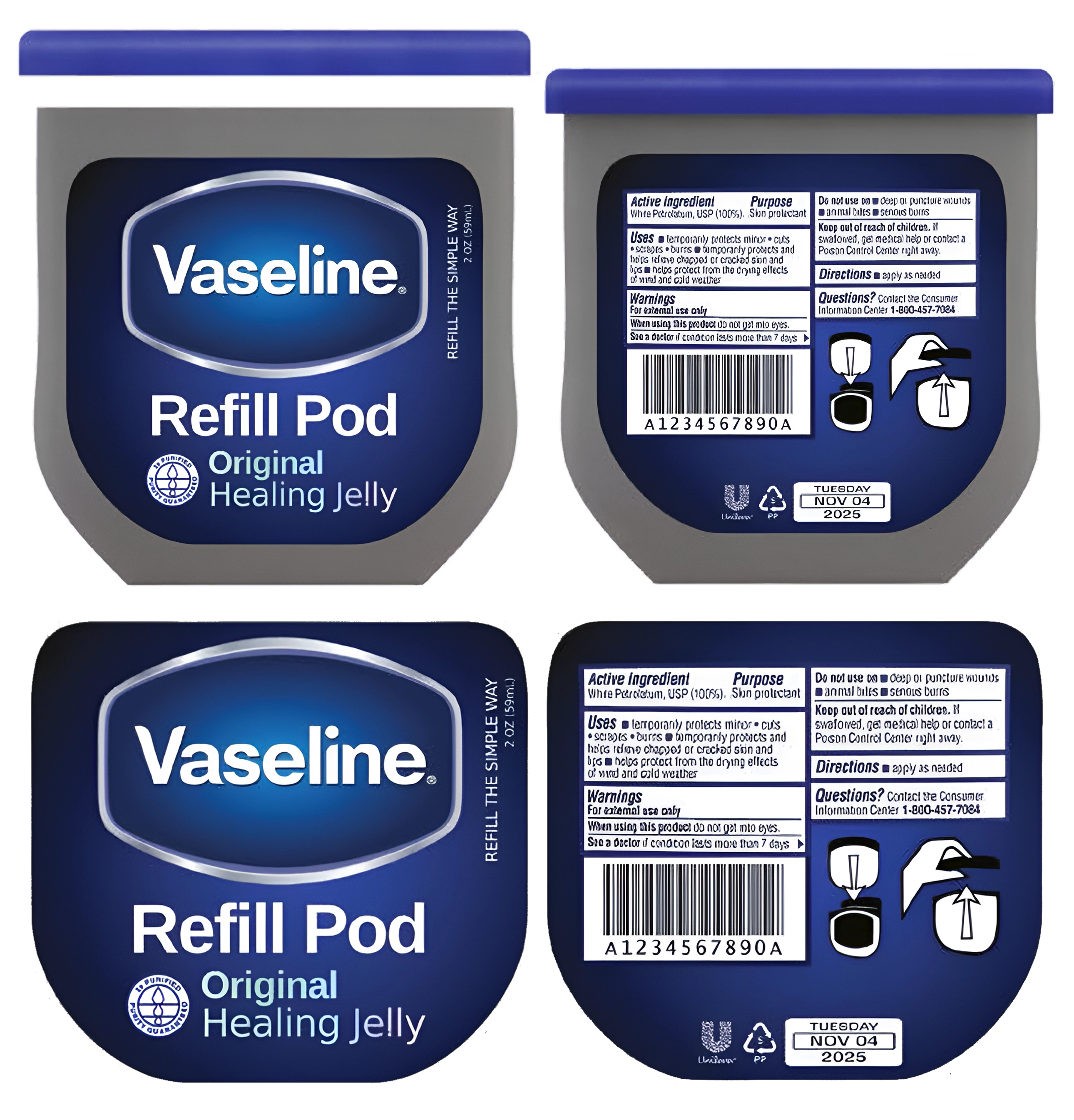
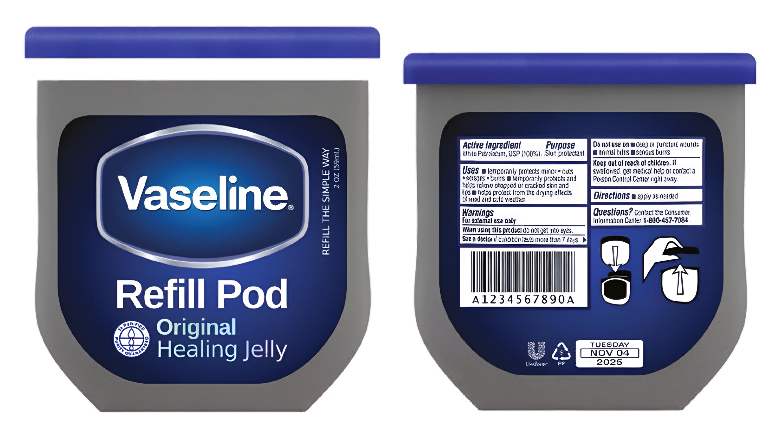
Unilever needed a sustainable solution to their Vaseline tubs; my team created its brand identity and marketed the idea.
We developed a refillable pod that lines the tub and can be conveniently disposed of once depleted, reducing overall waste. While keeping with Unilever’s established branding, we added holographic print in the subtitle to reinforce the Vaseline's familiarity and trust.
Its packaging features an informative infographic, providing clear, step-by-step instructions for consumers on how to use and recycle the product, enhancing both user experience and environmental impact.
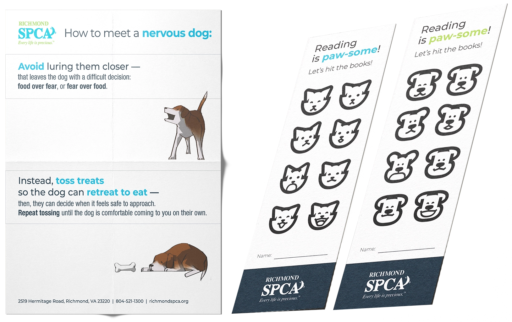
RSPCA encourages families to learn more about pets; I designed their campaign to encourage reading.
I made a set of interactive bookmarks to help kids track their reading progress, with playful cat and dog icons they'd color in after every finished book. Kids can name a pet from RSPCA's shelters after redeeming their completed bookmark.
I also designed a flyer with simple, original illustrations on how to approach a nervous dog. Negative space was key to matching the message. RSPCA’s light blue and green colors highlight text for emphasis.
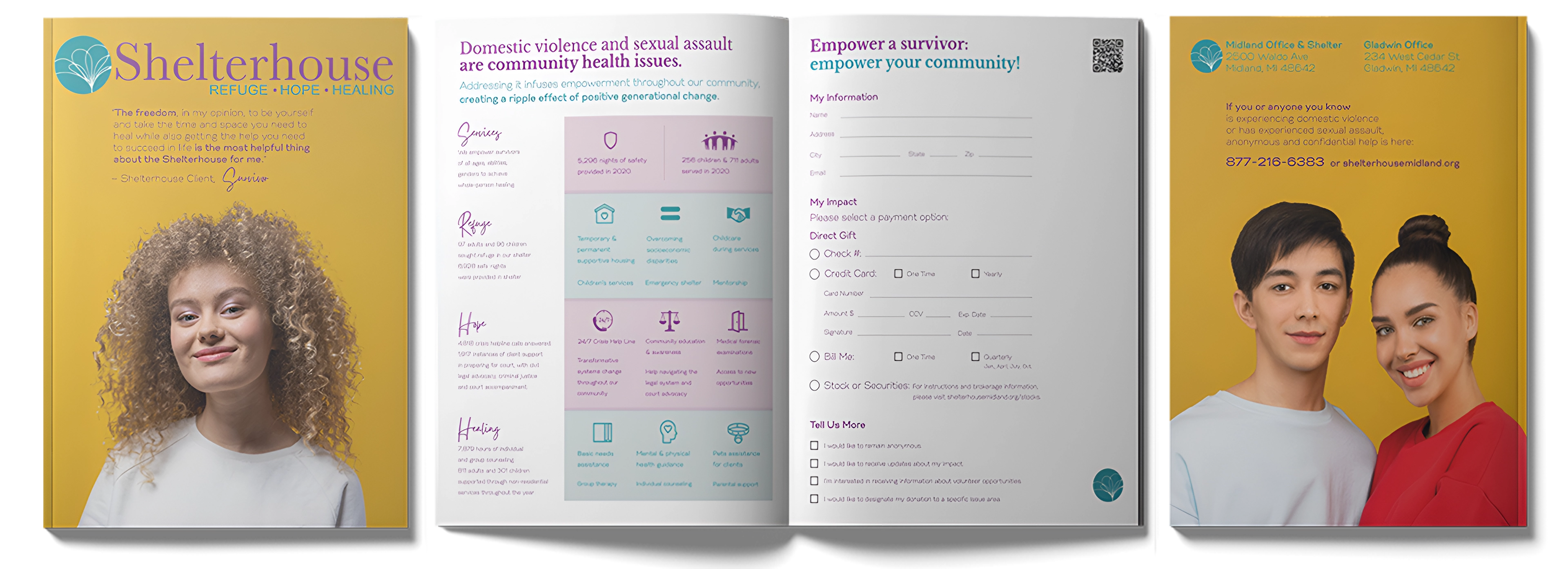
Shelterhouse invests in providing necessary services to survivors of abuse; for their donation sheet, I showed their accessibility through infographics and open space.
I created simple, easy-to-understand icons for each service, making sure they were clear and straightforward so anyone could recognize them at a glance.
By incorporating negative space, I ensured the typography remained clean and free from clutter. The cover features a goldenrod background, chosen for its warm and welcoming feel, while the brand’s lavender and teal tones create a calming contrast, maintaining a cool and neutral aesthetic throughout.
AJF held a week-long conference; for their itinerary and program booklet, visual clarity and balance were at the forefront.
By incorporating the brand's signature colors and typography, I highlighted key information while ensuring a cohesive flow throughout the booklet. Each page was carefully structured to maintain even visual weight, providing a polished and engaging user experience.